
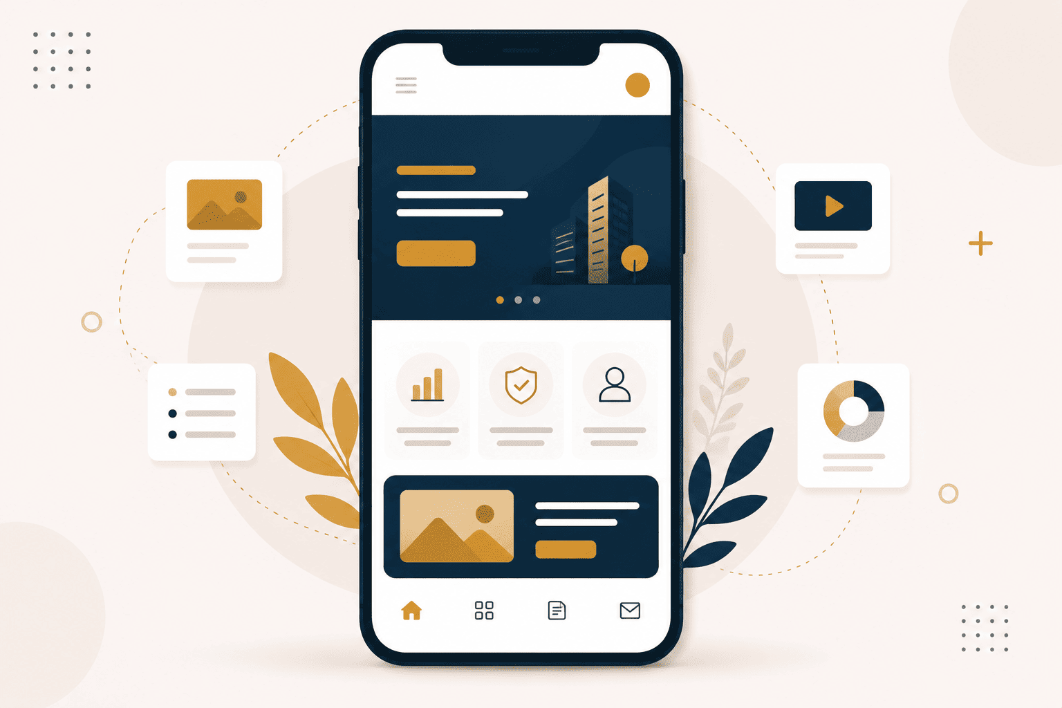
In many markets, mobile is the primary way people access the internet. If your website is not designed for mobile, you are turning away the majority of your potential audience. This is not a minor issue. It is a fundamental problem that affects your ability to reach and engage clients.
Mobile-first design means designing for the smallest screen first and scaling up. It prioritises the mobile experience rather than treating it as an afterthought. The result is a site that works well on any device, from the smallest phone to the largest desktop.
This guide explains why mobile-first design matters and how to implement it effectively.
Why Mobile-First Design Matters
The shift to mobile is not a trend. It is a permanent change in how people access the internet. For many users, a phone is their primary or only device.
Mobile is the Primary Device
In many markets, more people access the internet via mobile than via desktop. This is particularly true in developing markets where mobile adoption has outpaced desktop infrastructure.
If your site is not designed for mobile, you are not reaching these users.
User Experience
Mobile users have different needs and expectations than desktop users. They are often on the go, looking for quick answers. They interact with a touchscreen, not a mouse. They are more likely to abandon a site that is difficult to use.
A good mobile experience is essential for engaging these users.
Search Engine Ranking
Google uses mobile-first indexing, which means it predominantly uses the mobile version of your site for ranking. If your mobile site is poor, your search rankings will suffer regardless of how good your desktop version is.
Mobile-first design is not just about user experience. It is also about visibility.
Mobile-First Design Principles
Responsive Layout
Your site should adapt to any screen size. This is the foundation of mobile-first design. A responsive layout ensures that your site looks good and works well on phones, tablets, and desktops.
Responsive design involves flexible layouts, images that scale, and CSS that adapts to different screen sizes.
Fast Loading
Mobile users often have slower connections. If your site takes too long to load, users will leave before they see anything.
Optimising for speed is essential for mobile users. This includes compressing images, minimising code, and using efficient hosting.
Thumb-Friendly Navigation
Buttons should be easy to tap with a thumb. This means they need to be large enough and spaced far enough apart. Navigation should be simple and accessible.
Touch targets that are too small or too close together create a frustrating experience.
Readable Text
Text should be readable without zooming. This means using appropriate font sizes and sufficient contrast. Long paragraphs are particularly difficult to read on mobile.
Simple Forms
Forms should be simple and easy to complete on a mobile device. This means using appropriate input types, minimising the number of fields, and making buttons large enough to tap.
Common Mobile Design Mistakes
Desktop-Only Content
Content that is only accessible on desktop is content that is not accessible to mobile users. Ensure that all important content is available on mobile.
Tiny Buttons
Buttons that are too small to tap easily create a frustrating experience. Ensure that all touch targets are appropriately sized.
Fixed Width Content
Content that is fixed to a certain width will overflow the screen on mobile. Use flexible layouts that adapt to the screen size.
Pop-ups
Pop-ups are particularly intrusive on mobile. They cover the content and are often difficult to dismiss.
Testing Your Mobile Experience
Testing your mobile experience is essential. You cannot assume that a site that looks good on desktop will work well on mobile.
Tools like Google's Mobile-Friendly Test can help you identify issues. Manual testing on different devices is also valuable.
The Investment
Mobile-first design is an investment in your business. The cost of implementing mobile-first design is small compared to the cost of turning away mobile users.
The businesses that invest in mobile-first design are the ones that reach the widest audience.
Every business is different. What works for one may not work for another. If you would like to discuss whether mobile-first design could work for your specific situation, we are always available for a conversation.

Leave a Comment